Plot Curve Editor
PyDM plot widgets keep the inventory of curves in the curves property which
is a list of JSON strings containing the definition of parameters for each of
the curves in a plot.
Since editing a list of JSON strings via Qt Designer is very unfriendly and error prone, PyDM offers the Plot Curve Editor extension which can be invoked via a Right-click and selecting the “Edit Curves…” item in the context menu that pops-up.

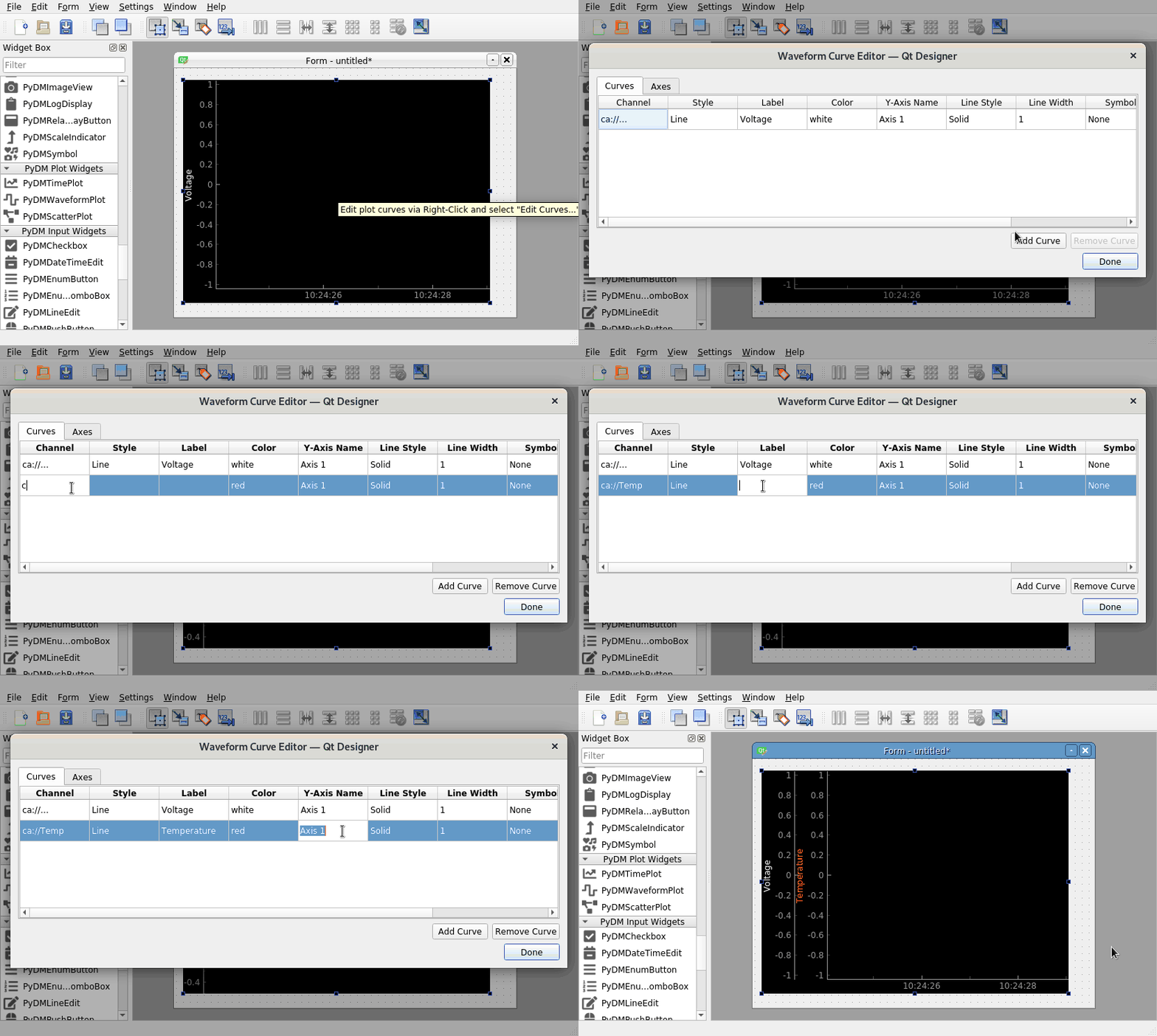
This animation demonstrates how to use the Curve Editor that is common to all the PyDM plot widgets.
The following is a description of some of the columns available in the editor, first for the curves tab:
Channel
The channel on which to access the PV to plot, usually in the format:
<protocol>://<channel address>
Channel Access Example: ca://MTEST:CosVal
- Style
Whether to render the curve as points/lines or bars. Only applicable to waveform and time plots, see the section on bar graphs below for more details.
- Label
The label that will be applied to this curve shown in the legend.
- Y-Axis Name
The name of the y-axis that will be assigned to this curve. It may be named anything you would like and will not show up anywhere in the plot. If you use the same name for multiple curves, then each curve will be associated with that same axis. To have a separate axis for each curve, simply use two different names. This name will also be displayed on a row in the axes tab in order to edit the properties of the axis itself.
And for the axes tab:
- Y-Axis Name
The name of the axis to set properties for. It must match the name used in the curves tab to be linked to that associated curve. Upon clicking on the axes tab, any axis names you have created for your curves will be automatically pre-filled here so that you do not have to type them again.
- Y-Axis Orientation
A simple option for placing the y-axis either on the left or the right of the plot.
- Y-Axis Label
The label that will be displayed along this axis.
- Min Y Range
The minimum value that will be displayed on the axis. Can be left to its default if using auto range.
- Max Y Range
The maximum value that will be displayed on the axis. Can be left to its default if using auto range.
- Enable Auto Range
When set to true, this axis will automatically update its display range if the curve it is linked to receives data that falls outside its current range. If this is set to true, then the min and max values specified will not be respected, so set this to false if you wish to only view data falling within those values.
- Log Mode
When set to true this axis will plot data using a logarithmic scale. Setting it to false will keep the scale as the linear default.
Note
This is not applicable for users interacting with widgets via Python code.
In this case you will need to serialize the list of JSON strings and use the
setAxes and setCurves property to configure the plot properly.
Bar Graphs
By selecting “Bar” from the style drop-down as described above, a curve can be plotted as a bar graph for waveform and time plots. This style of plot will have four additional options that may be set:
- Bar Width
The width of each bar rendered on the plot. Will default to 1 if not set.
- Upper Limit
An optional column, set to a number. Any bar which exceeds this number will be drawn in the alternate limit color. Useful to draw attention to bars exceeding an expected upper limit. Simply leave it blank if this functionality is not needed.
- Lower Limit
Same as the upper limit, except on the lower side. Any bar below this limit will be drawn in the alternate limit color. May also be left blank if not needed.
- Limit Color
The color to draw any bar which exceeds either limit described above.
These options will not be displayed unless at least one curve in the editor has been set to the bar graph style in order to reduce clutter. A plot in which both styles are combined will work just fine. All options for both line styles and bar styles will be displayed in that case, and options that make sense for only a specific style of plot will only be applied to curves matching that style.